

Exploring Galaxy-Inspired Animations: BlueNote Pro Icon Motion
How BlueNote Pro Enhances UX with Subtle Galaxy Animations

The BlueNote Pro animation introduces an elegant, galaxy-like motion within its sheet interface, adding a touch of sophistication and interactivity. Here’s a breakdown of the animation’s sequence:
1. Icon Fades In and Scales Up
The animation starts with the BlueNote Pro icon fading in and scaling up. Simultaneously, an elliptical path begins to trace the icon's motion.
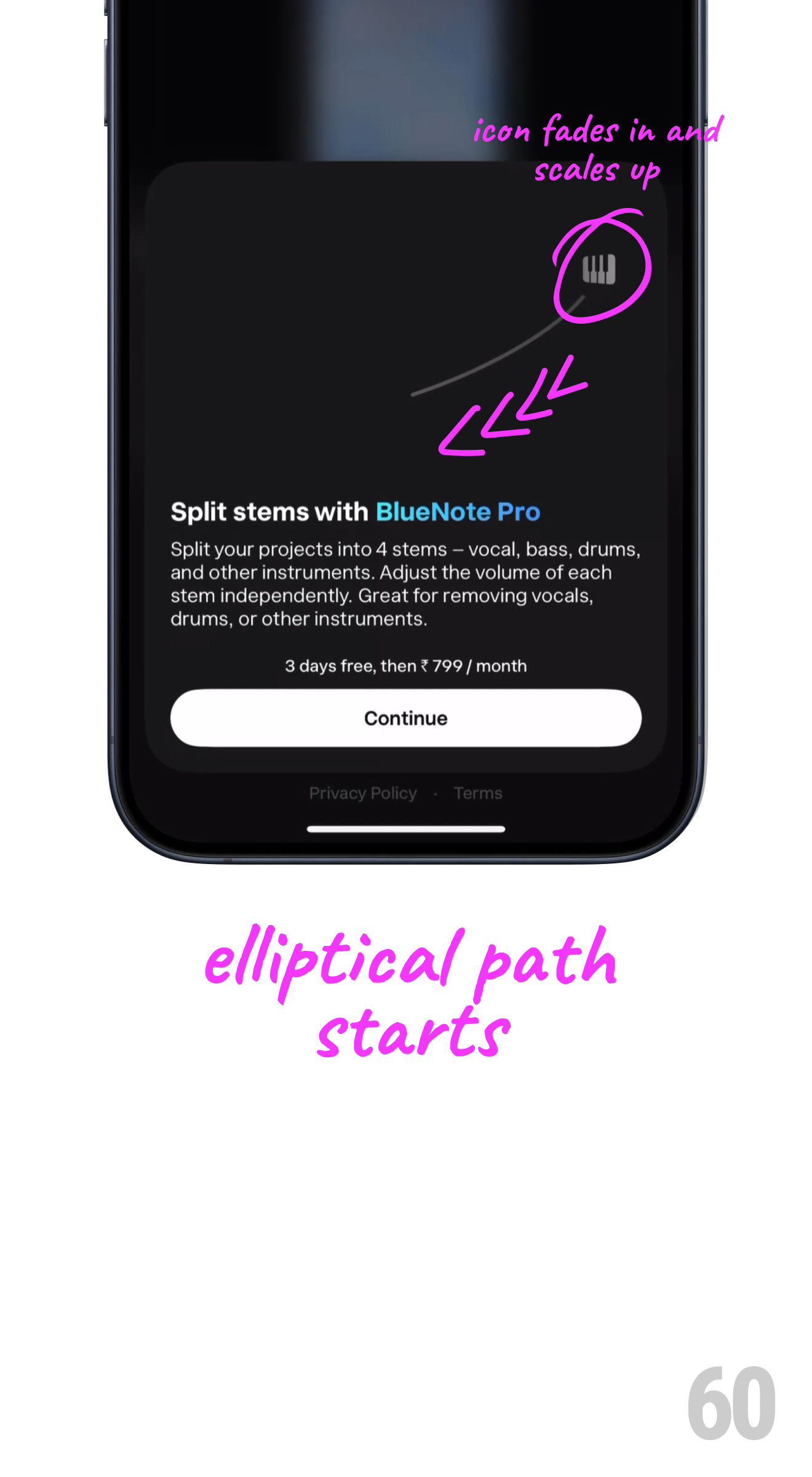
This subtle entrance grabs attention and sets the tone for a dynamic visual experience.
2. Elliptical Path Expands
As the icon moves along the elliptical path, it begins to rotate slowly, adding depth and realism to the motion.
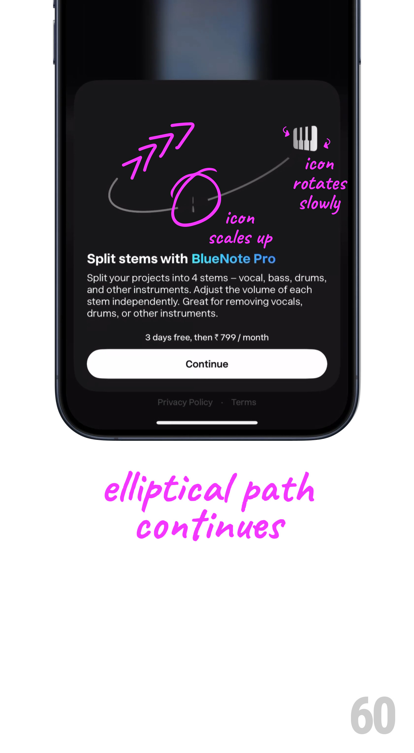
The rotation and scaling work together to simulate a graceful orbital movement, akin to planets in a galaxy.
3. Multiple Icons Scale Up
More icons, representing different functionalities (like bass, vocals, drums, etc.), join the animation, scaling up along the elliptical path.
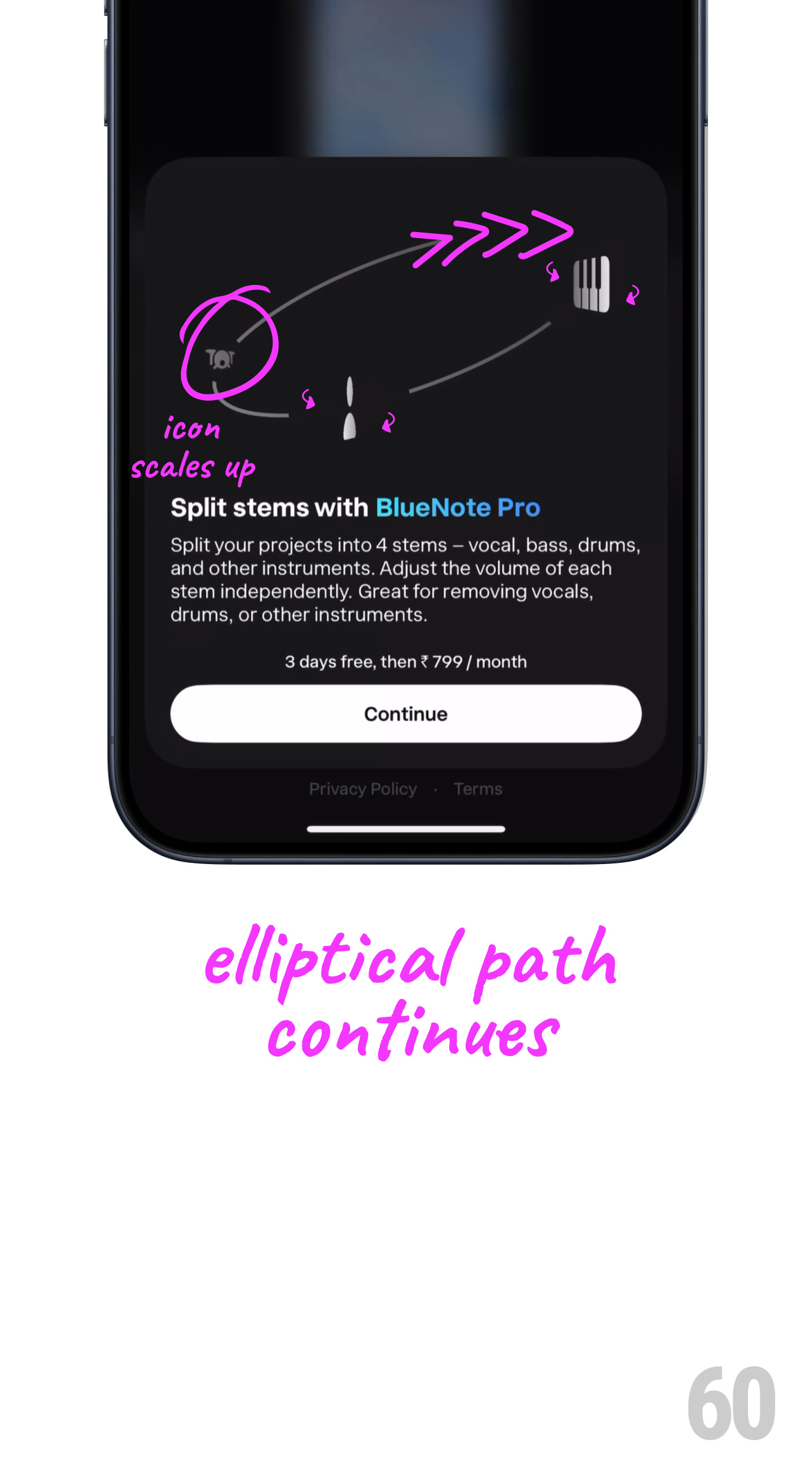
The smooth appearance of additional icons builds anticipation and visual interest.
4. Galaxy Motion Intensifies
The entire animation intensifies as the motion completes its elliptical path, with all elements rotating harmoniously. The primary icon continues its subtle rotation, maintaining focus.
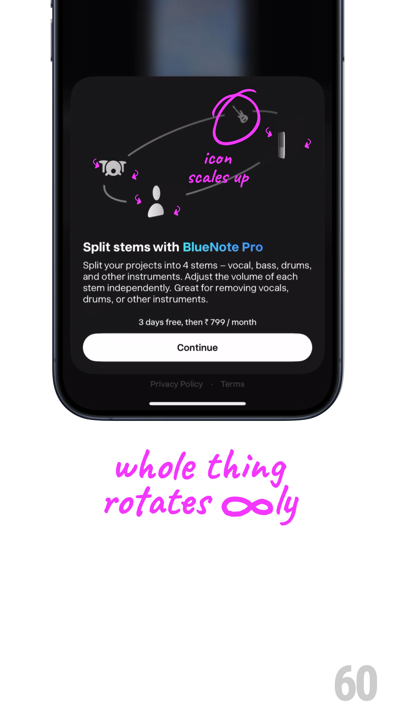
The consistent motion ensures a seamless user experience while keeping the user engaged.
5. Final State: A Celestial Composition
The animation concludes with all icons aligned in a visually balanced galaxy formation, emphasizing functionality and branding.
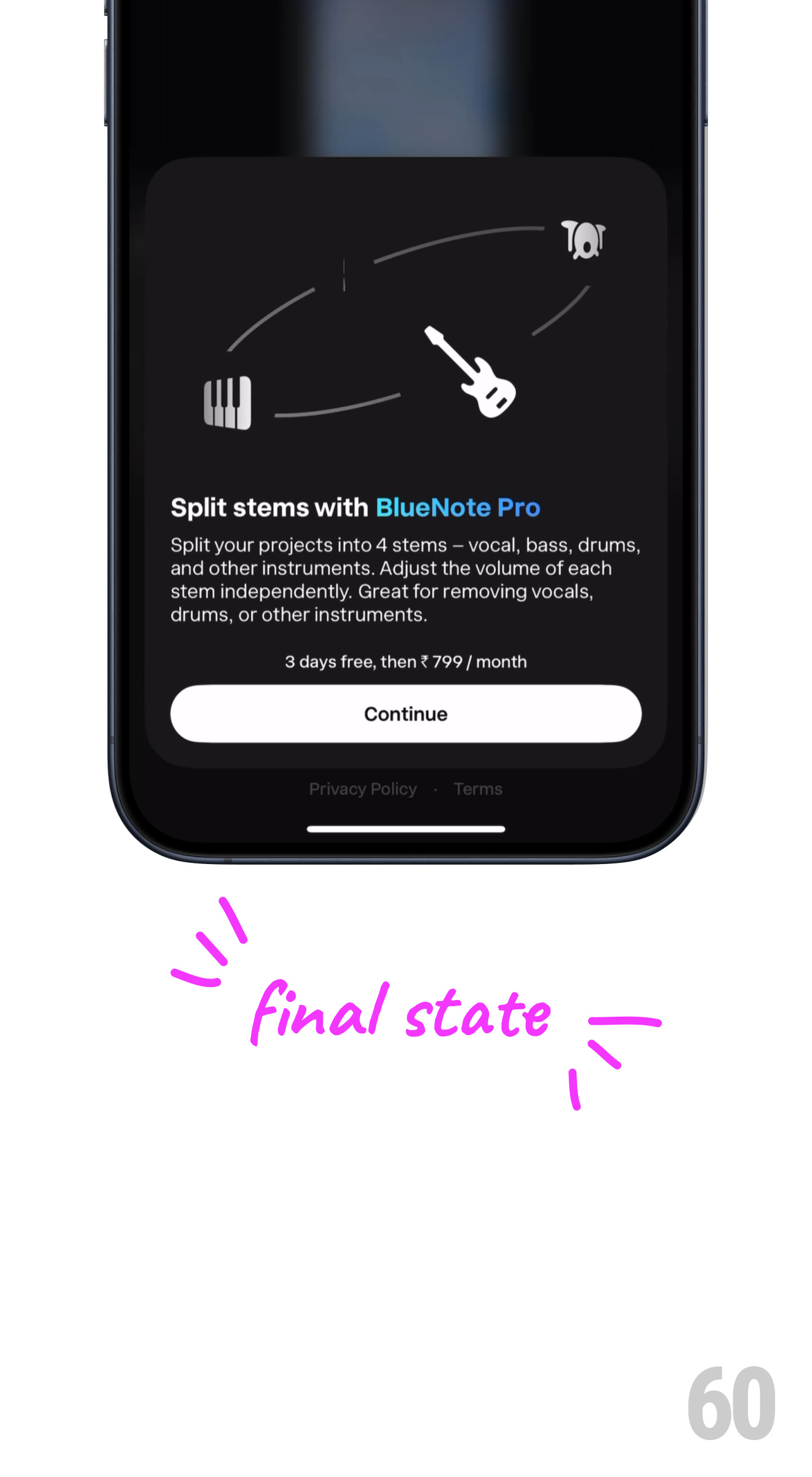
This final state creates a sense of completion and readiness for interaction.
Why This Animation Stands Out
BlueNote Pro’s galaxy-inspired animation is a prime example of how micro-interactions can enhance user experience. Here’s why it’s effective:
It’s Subtle Yet Engaging: The smooth transitions and scaling effects provide a polished feel.
It Reflects the Brand: The galaxy motion aligns with BlueNote Pro’s identity as an innovative and creative tool.
It Enhances Usability: The motion guides the user’s attention, subtly emphasizing key functionalities.
It Feels Natural: The seamless transitions mimic natural orbital motion, making the animation intuitive and satisfying.
✨ For more inspiring animations and micro-interactions, visit 60fps.design/storyboards.